Gordon College Website | Web Design
Gordon College | Website
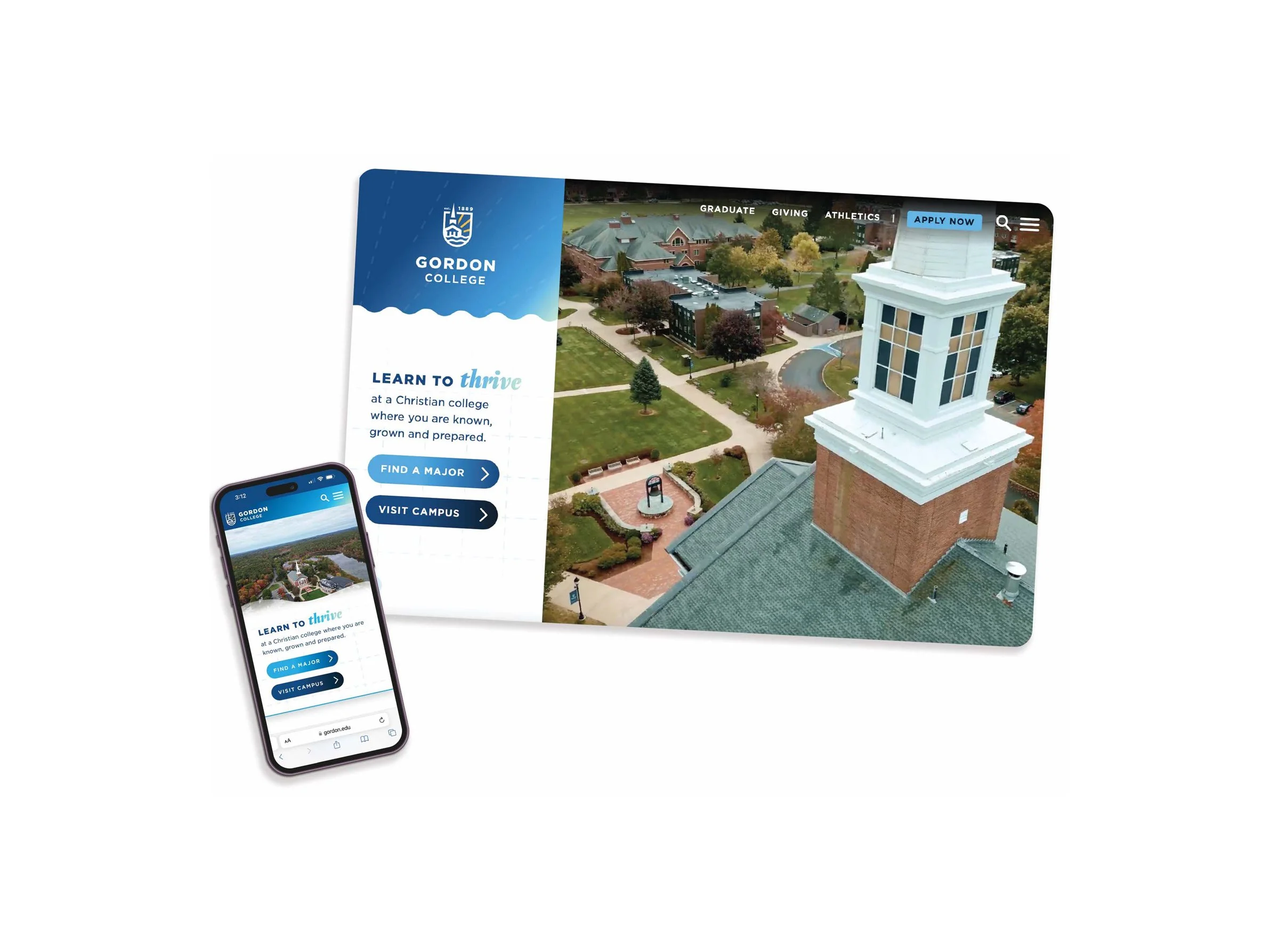
Task | As part of an overall brand refresh, the web team leader and I redesigned the Gordon College’s website, starting with the homepage and a brand new way for prospective students to discover academic programs that matched their interests.
Full Homepage Design
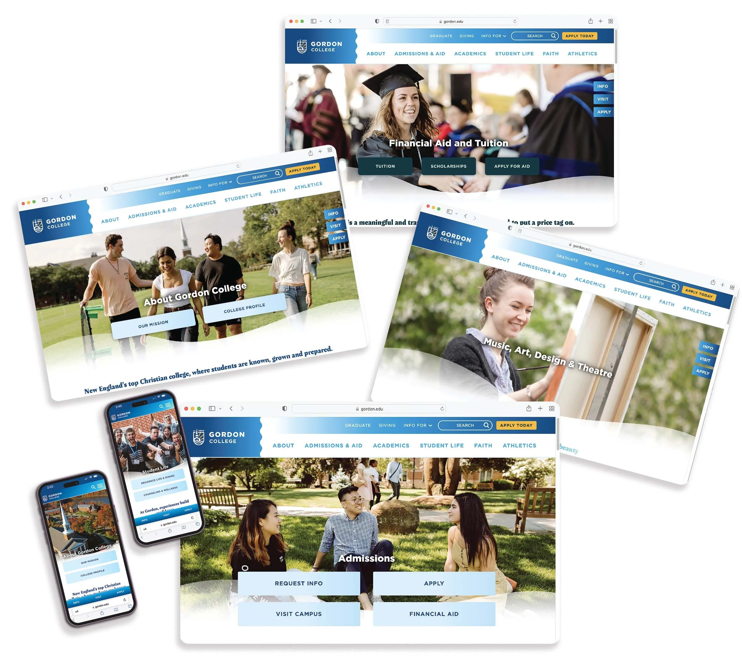
Second Level Landing Page
Gordon’s design style is classy but casual appearance built on clean, structured and well-placed layouts softened through intentionally placed curves, waves, or rounded corners. Gordon likes to have bold headlines paired with thin lined icons or supporting text. In order to showcase their community Gordon liked to have vibrant photography featuring their people and their place. Gordon’s primary color is dark blue accented by the additional brand colors intended to be used as an accent in the design.
Major Feature Flow:
Gordon made the decision to replace the massive list of programs with nine confined grouped tiles that lead to freshly developed landing pages for popular program groups. Here you can see the web flow of the Business, Media & Marketing Programs.
Visit Gordon Flow:
Having an easy-to-navigate website is important for users to see exactly what they are looking for by having clear CTA’s, vibrate photography and color. Here you can see the web flow of the Admissions Visit Gordon page
Visit Area Guide Flow:
Gordon likes to promote their location and all the opportunities around campus. Highlighting Gordons casual side, this page is heavily influenced by color, vibrant photos, and illustration showcasing the best things around the North Shore of Boston. Here you can see the web flow of the Area Guide.


